Anúncios
What if one simple shift in your palette could change every first impression you make? This article opens a practical color coordination styling guide that turns guesswork into repeatable results.
They define the method as a step-by-step way to make outfits and spaces feel intentional. Readers learn basics, pick a personal base palette, apply classic schemes, and use proportion rules so a look reads polished.
Up to 90% of first impressions are influenced by color, so this is a useful skill, not just an aesthetic choice. The piece ties in Itten’s wheel and simple color theory to help readers build effective palettes.
The tips apply to wardrobes, interiors, and brand presentation, letting people transfer principles across contexts. It also shows how trends fit as accents, not the whole direction, so fewer random choices lead to clearer, confident results.
Why Color Coordination Matters for a Polished Look
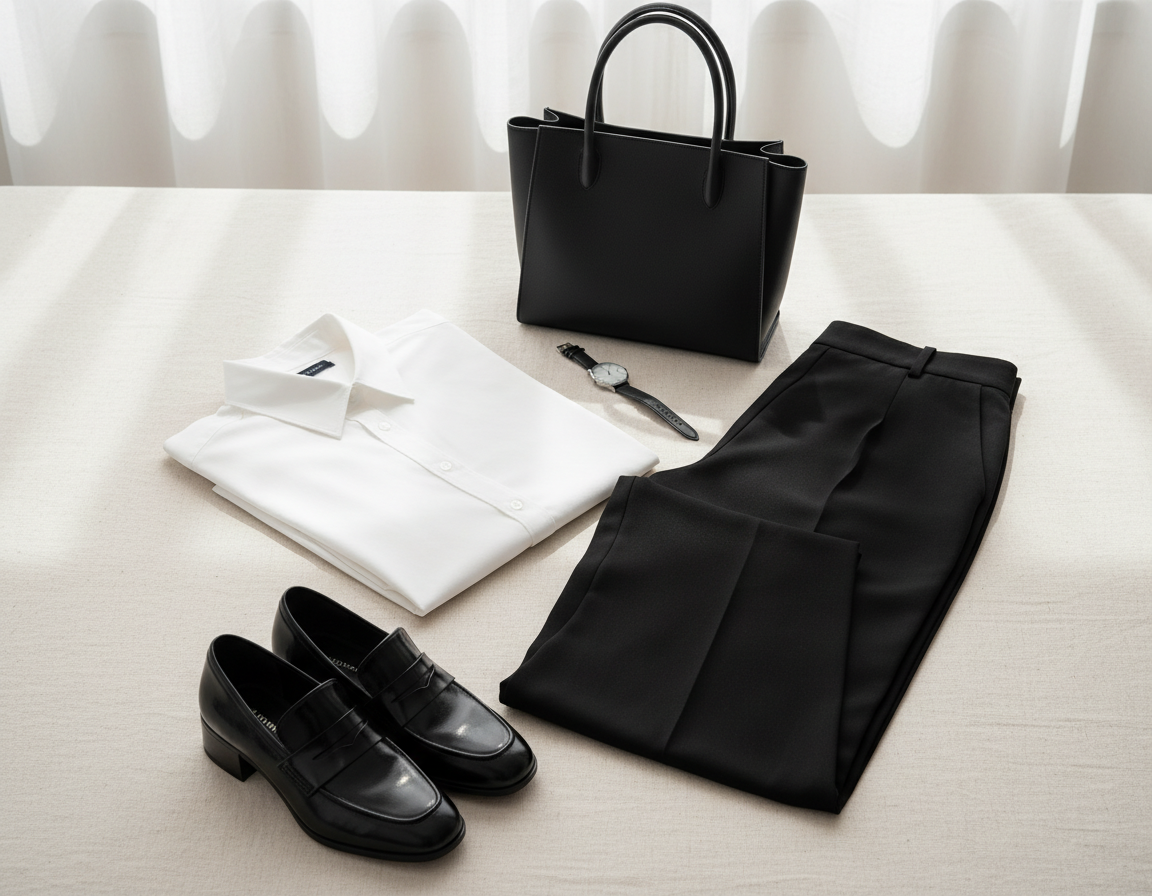
A person’s palette operates like shorthand—viewers decode mood, competence, and intent in seconds. Up to 90% of first impressions are influenced by color, so choices matter far beyond aesthetics. Effective use of hues helps someone appear more put-together and confident in interviews, dates, and presentations.
Anúncios
How hue shapes first impressions in life and style
High-contrast pairings can read bold and energetic, while softer tones feel calm and refined. That deliberate balance changes how approachable or competent someone seems.
Why context and perception change how shades land
Identical colors can look different in a boardroom, at brunch, or on a stage. Season, fabric, and surrounding materials shift perception. Personal factors—skin undertone or past associations—also alter the way a shade reads, so testing is essential.
- Real outcomes: hues affect perceived competence and warmth in real situations.
- Setting matters: work vs weekend or North American versus Northern European tastes change acceptable pairings.
- Use as art direction: the goal is clearer signaling, not more saturation—ask whether pieces support the impression they want to create.
Understand the Color Wheel Basics Before Building Color Combinations
The Itten wheel gives a predictable map so anyone can mix hues with purpose.
Anúncios
The wheel organizes primary colors — red, blue, and yellow — and shows how secondary mixes and tertiary colors sit between them. This map helps a person choose combinations that read intentional instead of accidental.
Primary, secondary, and tertiary on the wheel
Primary colors are the base. Mixing them yields secondaries like green, orange, and purple. Tertiary colors are the in-between mixes, useful for subtle wardrobe or interior accents.
Hue, shade, tint, and tone
A hue is the pure version of a pigment. A tint adds light for a softer look. A shade adds darkness for depth. A tone adds gray to mute intensity.
Warm vs cool and mood
Warm hues (reds, oranges, yellow) feel energetic. Cool colors (blues, green, purple) feel calm and clean. Balancing warm cool elements changes how an outfit or room communicates.
| Element | Example | Practical use |
|---|---|---|
| Primary colors | Red, blue, yellow | Choose a strong base like navy or mustard accents |
| Tertiary colors | Yellow-green, red-purple | Use for subtle contrast and depth |
| Tints / Shades / Tones | Pastel blue / deep navy / muted teal | Adjust formality and perceived value |
Quick checkpoint: before pairing pieces, identify each item’s hue family, temperature, and value (light or dark). This prevents clashing undertones and makes later schemes—complementary or analogous—easier to apply.
For a short primer on wheel mechanics, see color wheel basics.
Build a Personal Color Palette That Feels Intentional, Not Trend-Driven
Start by noticing the shades they reach for most—those repeats reveal a reliable personal palette.
Identify go-to colors
The easiest evidence of a personal set of colors is what someone buys, pins, or wears repeatedly. Those items show natural preferences and reduce guesswork.
Pick a steady base
Navy or indigo works as a dependable base that anchors outfits or rooms. A consistent base cuts decision fatigue and boosts cohesion.
Add light and dark variance
Mixing lighter and darker shades and tones prevents a flat look. Small contrasts create depth similar to layered hair color.
Balance cool palettes with warm accents
Cool-heavy schemes can feel crisp but distant. Introduce warm materials—wood, caramel, or a hint of gold—to make a palette feel inviting without altering the base.
Use seasonal accents and accessories
Keep one rotating accent via scarves, jewelry, bags, or pillows. This makes trends easy to try and easy to remove.
| Step | Action | Result |
|---|---|---|
| Observe repeats | Track purchases and saved items | Reveal go-to colors |
| Select base | Choose navy or indigo | Consistent anchor across looks |
| Add depth | Introduce light/dark shades and tones | Richer, dimensional palette |
| Accent strategy | Use seasonal accessories and one accent | Trend flexibility without overwhelm |
Example approach: strong indigo base + lighter blue/gray notes + warm metals or wood + one rotating accent. This offers a clear way to stay intentional while permitting small seasonal shifts.
color coordination styling guide to Classic Color Schemes That Always Work
A handful of trusted schemes covers most practical needs, from bold statements to quiet, polished looks.

Complementary contrasts for bold impact
Complementary colors sit opposite on the color wheel, so blue and orange create high contrast. Use this for statement looks or confident branding.
Mute one side when less intensity is needed—soften orange or pick deep blue to make the combination wearable.
Analogous blends for calm stories
Neighboring hues form analogous schemes. They share undertones, so outfits read calm and cohesive. Ideal when a subtle flow matters.
Triadic balance for lively, stable looks
Triadic harmony uses three evenly spaced colors—red, blue, yellow—as a balanced approach. Vary intensity so the result never feels chaotic.
Split-complementary and monochrome options
Split-complementary pairs one base with two adjacent complements for contrast with less tension.
Monochromatic dressing uses one color across multiple shades and tones to add depth with minimal fuss.
| Scheme | What it is | Outcome | When to use |
|---|---|---|---|
| Complementary | Opposite on wheel (e.g., blue + orange) | High contrast, bold | Statement looks, branding |
| Analogous | Neighboring hues | Serene, blended | Everyday wear, interiors |
| Triadic | Three even points (red/blue/yellow) | Balanced, colorful | Playful formal looks |
| Monochrome | One color, many tones | Polished, layered | Minimal, refined outfits |
Use Proportion Rules to Keep Color Choices Balanced
Balance often beats perfect matches — how much of each hue appears matters more than the exact choices.
Simple percentage rules give a quick way to set hierarchy. They help a palette read intentional and prevent visual noise.
80/20: dominant plus a strategic accent
The 80/20 rule makes one base hold the look while a small accent adds interest. For clothing, think suit (80%) and tie or pocket square (20%).
60/30/10: base, secondary, accent
This three-part ratio suits rooms and outfits. Walls or major pieces form the base, larger furniture or clothing items act as secondary, and a single accent ties the scheme together.
When 60/40 and 50/50 work (and when they don’t)
Use 60/40 to soften contrast. Avoid 50/50 with complementary pairs — equal splits force the eye to flip and can feel flat.
Rule of odd numbers
Three or five elements create visual energy. Odd counts help the brain prioritize and keep combinations lively.
| Ratio | Use | Example |
|---|---|---|
| 80/20 | High dominance + accent | Jacket 80% / Scarf 20% |
| 60/30/10 | Balanced triad | Walls 60% / Sofa 30% / Cushions 10% |
| 60/40 | Soft two-tone | Dress 60% / Coat 40% |
| 50/50 | Equal split — use sparingly | Two equal panels; can feel flat |
Quick checklist: decide the base, confirm the secondary supports it, then pick one accent and place it consistently. This way the scheme keeps contrast readable and polished.
Expert-Level Factors That Change How Colors Look in the Real World
Small shifts in lighting, material, or culture can rewrite how a hue reads in seconds.
Cultural signals and U.S. reactions
Regional taste alters what feels cheerful, calm, or intense. In the U.S., harsher mixes like black/white/fuchsia often read energetic and modern.
Choosing hues as a personal brand signal
Blue remains the most common trust anchor; many top brands use it to signal reliability. Pick tones that match the desired message—calm, bold, or approachable.
Luxury versus budget cues
Brightness and saturation affect perceived price. A restrained bright orange can feel premium. Too much saturation or chunky type pushes a cheaper read.
Online vs offline behavior
Screens emit light; fabrics and paint reflect it. Test swatches under daylight and warm indoor light before committing.
Train the eye
- Compare swatches in two lights.
- Use tools like Adobe Color, Khroma, Coolors, Color Space to explore harmonies from the wheel.
- Practice by noticing small shade shifts in daily objects, per Michael Wolff’s approach.
| Factor | What to check | Practical tip |
|---|---|---|
| Cultural context | Local taste intensity | Sanity-check palettes for the U.S. audience |
| Material & light | Reflectivity and sheen | View samples in room lighting and on screen |
| Saturation | Perceived price | Mute one side or add navy as a base to stabilize |
Conclusion
A repeatable method, helps anyone build a palette that reads deliberate and polished.
Start with the color wheel, pick a dependable base, then choose a proven color scheme like complementary or analogous. Apply simple ratios—80/20 or 60/30/10—to set hierarchy and keep visual balance.
One color outfits or rooms remain dynamic when tones and values vary. Test samples in real light and on real materials before finalizing any combinations to avoid surprises from digital displays.
Save a small set of favorite pairs, repeat them, and rotate accents seasonally. When balance and context guide choices, using the wheel and rules turns an uncertain process into a reliable skill.