Anúncios
Surprising fact: a recent wardrobe study found that nearly 60% of Americans leave patterned items unworn because they fear creating a busy appearance.
This guide promises clear, practical rules that help readers pair prints with confidence. It explains what makes an outfit feel overwhelming — too many focal points, no shared color story, or clashing scale and contrast — and offers simple formulas to fix each issue.
The article will walk through pattern basics, a pattern-anatomy checklist, and real-world applications for work, errands, brunch, evening events, and wedding guest looks. It treats wardrobe building as lasting craft rather than fleeting trend talk.
Readers can expect action-ready frameworks: a hero-pattern method, color harmony rules, scale strategies, an accessory “whisper” rule, and layering tactics. Concrete examples include stripes, polka dots, florals, and animal prints, plus shopping guidance so favorite pieces get worn.
Why Patterned Pieces Feel Tricky and Why They’re Worth It
Wearing a print often feels risky because prints arrive with built-in visual interest that raises the stakes for every other item. That single element can read loud, so each additional piece must earn its place.
Anúncios
Prints communicate mood and identity. Romantic florals whisper soft and vintage polka dots call classic charm. Modern geometrics and abstract design read artsy and contemporary. These cues make a printed dress an expressive wardrobe shortcut for everyday life in the U.S.
What makes a look overwhelming? Common signs include multiple statement zones, competing contrast levels, and head-to-toe busy pattern with no breathing room. Accessories that fight the main piece intensify the chaos.
Visual hierarchy fixes this. Pick one clear statement and let supporting elements reinforce it. Simple, intentional choices create polish instead of noise.
Anúncios
- Add a solid layer or neutral shoes for immediate calm.
- Repeat one color across pieces to tie the design together.
- Scale back jewelry size so accessories whisper, not shout.
A printed dress can serve as a complete outfit when balanced correctly. Understanding difference in pattern vs. print will make shopping and selection easier; the next section explains that distinction and why it matters for texture, durability, and styling.
For quick tips on wearing lively prints with confidence, see this short guide: 8 tips for wearing printed clothing.
Patterns vs. Prints: The Difference That Helps You Shop Smarter
Distinguishing woven repeats from surface artwork changes what buyers expect from fit, feel, and lifespan. Recognizing this difference helps with quick, practical choices in the dressing room and online.
Woven designs and printed surfaces — how to tell
Clear definition: a pattern is any repeated design; a print is a design applied on top with dye. All prints are patterns, but not all patterns are prints.
Quick tests and real wear impact
Backside test: flip the fabric — if the design disappears on the reverse, it is likely a print. This data point signals differences in texture and light reflection.
- Woven patterns read textured and subtle; printed pieces often look bolder and more graphic.
- Printed surfaces can fade with repeated washing; woven repeats usually age more evenly over time.
- Read the fabric description, check composition, and shop with an immediate pairing in mind — make sure the piece works with items already owned.
Next step: once the pattern or print type is clear, the pattern anatomy checklist offers a simple way to mix prints with confidence.
The Pattern Anatomy Checklist That Makes Mixing Prints Easy
A repeatable anatomy checklist helps anyone judge a print’s mixing potential in seconds. Use these seven lenses as a quick rubric before pairing two pieces.
Scale
Small motifs read finer and sit well with larger pieces; large motifs add visual weight. Consider height and body proportion: big prints can broaden, so place them where added volume is welcome.
Density
Density measures negative space. Dense designs keep the eye moving and can feel slimming. Sparse motifs create clear focal points for intentional emphasis.
Contrast
Low-contrast texture prints behave almost like a neutral and mix easily. High-contrast statement prints demand simpler companions—think bold polka and crisp stripes.
Order vs. Randomness
Classic repeats provide structure; artsy, random layouts feel freer. Pair one controlled repeat with one freer design for a balanced visual conversation.
Coloring
Bright palettes read vivid; muted palettes read calm. Match contrast level with personal colouring: low-contrast people often appear more harmonious in softer prints, while high-contrast individuals can carry bolder mixes.
Placement
All-over designs create uniform interest. Placed motifs or border florals create built-in focal points and can reduce the need for extra accessories.
Style Associations
Decode cultural cues—vintage polka and dots feel nostalgic, bohemian paisley reads relaxed, classic stripes read tailored, and animal prints read glamorous. Mix within or contrast these vibes intentionally.
Quick checklist: review scale, density, contrast, order, coloring, placement, and style. If five of seven align, the pair will likely keep balance and interest without fighting for attention.
How to Style Patterned Outfits Without Overthinking It
Start with one print as the lead actor and let other pieces play supporting roles. This Hero Pattern Method keeps the look purposeful. Choose a single statement print, then echo one color or texture in the rest of the outfit.
Solids are purposeful, not boring
Solids create breathing room that makes a print read intentional and elevated. A clean jacket, neutral shoe, or simple knit will calm visual noise and lift the main print.
Match silhouette with print mood
Bold, graphic prints work best with streamlined shapes like straight trousers or a sheath dress.
Smaller, softer motifs allow more volume—think tiers, puff sleeves, or full skirts—without chaos.
A simple decision tree and easy wins
- If contrast is high, simplify silhouette and accessories.
- If contrast is low, add structure or a stronger shoe for punch.
- Easy formulas: printed top + solid denim; printed skirt + solid knit; printed dress + solid layer (blazer, denim, leather).
Keep the eye moving: define the waist, control hem lengths, and avoid stacking oversized pieces. These small edits preserve balance and favor the body.
Next: even when pairing prints, shared color is the fastest path to cohesion; the following section explains color harmony rules that make mixes look intentional.
Color Harmony Rules for Mixing Prints That Look Intentional
Using color as a unifying thread makes different patterns feel like they belong together. When colors relate, the eye reads the look as purposeful rather than accidental. This approach creates instant balance across prints.
Match shared colors across prints for instant cohesion
Pick two prints that share at least one visible color. Repeat that hue in shoes or a bag for a tidy finish. This small echo makes varied motifs read as a single idea.
Pair neutral prints with colored prints for an easy backdrop
Neutral prints—think black/white, navy/cream, tan/ivory micro-geometrics—act like calm fields. They stabilize brighter colours and let a vivid print take the lead without competing.
Use complementary colors when contrast is wanted
Complementary pairings (blue with orange accents, for example) offer crisp energy. Keep one color quieter or in a smaller dose so the combo reads sharp, not clashing, and is safe when you mix prints.
Work with neighboring colors for a softer, tonal mix
Tonal mixes—blue, teal, green families—create an editorial, low-contrast result. This route suits anyone who wants subtle cohesion rather than bold contrast across patterns.
- Limit the palette to 2–3 main colors plus a neutral.
- Make sure one print is lower contrast or smaller scale.
- Repeat at least one shared color in an accessory for cohesion.
Quick debug: if a look feels loud, remove one color via a different bag or shoe. This small swap is the easiest way to calm a busy combination before reworking the whole look.
Mixing Stripes, Florals, and Polka Dots: Combinations That Actually Work
Combining bold lines with soft blooms requires one confident element and one calming partner. That leader/supporter principle keeps the eye focused and prevents visual fighting.
Leader/supporter rule: the leader is bigger, higher contrast, or denser. The supporter is smaller, lower contrast, or neutral. This simple hierarchy makes mixed prints read as a single idea, not a clash.
Stripes + florals
Reliable pairings: thin stripe with medium floral; navy-and-white stripe with a bright floral; wide stripe with a tiny ditsy bloom.
Why it works: stripes offer structure and act like a visual anchor. When stripes lead, florals soften the mood and add color without stealing focus.
Polka + stripes
Keep scale different: micro polka with bold stripes, or large dots with narrow lines. Scale separation prevents visual vibration and makes each pattern readable.
Tip: choose a shared neutral—black, navy, or tan—to calm the mix and tie pieces into a single outfit.
Florals + geometrics
Balance romantic and modern by controlling color and silhouette. A structured blazer with a floral skirt modernizes blooms. A geometric top with a soft floral bottom keeps the look fresh.
- Starter combos: thin stripes + small florals; micro polka with muted stripes.
- Bolder combos: high-contrast stripes with large florals; large dots with graphic stripes for confident wearers.
- Troubleshoot: if both pieces feel equally loud, lower contrast in one—swap for a softer colorway.
Quick check: photograph the look in natural light. If the camera reads busy, the eye usually will too. Small edits—neutral shoes or a solid layer—do more than a brand-name bag when calming prints.
Scale Strategies: The Easiest “Big Print + Small Print” Formulas
A deliberate mix of one large motif and one tiny repeat gives the eye a clean rhythm and keeps looks composed. Use this simple formula when pairing prints: one bold field, one near-solid or micro-repeat companion.
When oversized patterns flatter and when they overwhelm
Oversized motifs flatter on streamlined silhouettes and restrained colorways. A single dramatic motif can read modern and editorial when the cut is clean.
They overwhelm when paired with extra volume—think tiered maxi plus bulky outerwear. That combination can blur shape and erase proportion.
Petite-friendly placement and proportion
Petites should favor placed prints, vertical seams, and defined waists. A shorter hemline or nipped waist keeps a dress from wearing the wearer.
Use a medium-scale motif near the torso and a micro-print for the rest; this adds interest without swallowing height.
Use print size to shape and a quick one-change test
Dense micro-prints read sleeker; large motifs add visual volume where needed—for balancing shoulders or hips.
- Big + small: one oversized motif with one micro repeat.
- One-change test: add a cropped solid layer (blazer or jacket) if the field feels too large.
- Reliable formula: statement printed dress + neutral shoe + solid layer guarantees wear at least one way.
Accessory Rules: When the Outfit Talks, Accessories Should Whisper
Let accessories finish the look quietly; they exist to add polish, not to create a second headline. Patterned garments already carry contrast and movement, so accessories should reinforce the idea rather than compete.
Jewelry
Keep metal minimal. Choose delicate gold chains, a fine bracelet, or small hoops for everyday wear.
A single subtle statement pendant works when the neckline is simple and the print contrast is low. This gives interest without stealing focus.
Bags
For city and work looks, pick structured neutrals—black, tan, or navy leather—for instant polish.
For vacation or boho pieces, woven raffia or a compact crossbody echoes texture without adding another print.
Shoes
Start with neutral sandals, loafers, or suede flats; these choices keep the balance and read intentional.
Metallic footwear is effective only if it is the single shine element in the look. If the rest remains controlled, metallic can act as a subtle accent.
- Pick one secondary color from the print—often a quieter hue—and repeat it in a bag or shoe for cohesion.
- Let a denim or leather jacket function like an accessory; keep it solid to avoid pattern stacking.
- Quick checklist: one focal accessory max, one metal tone (preferably gold), and one texture accent—then stop.
Layering with Pattern: Denim Jackets, Blazers, Trenches, and Leather
Layering turns a busy print into a controlled look by adding structure and visual breaks. A solid outer piece breaks up a pattern field, signals occasion, and adds shape. This is the fastest way to tone down a print while keeping the look intentional.
Denim jacket meets printed dress
For daytime and weekend wear, pair a dark-wash denim jacket with a striped or printed dress. Dark denim reads cleaner than distressed options and elevates casual shoes like sneakers or espadrilles.
Quick formulas: printed midi + dark denim jacket + white sneakers; mini dress + cropped denim + ankle sandals.
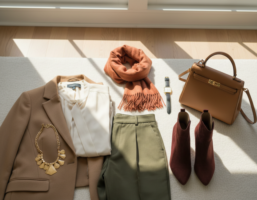
Blazers that “editorialize” prints
A sharp blazer adds structure and authority. Clean lapels and slight shoulder definition make florals and polka dots feel office-appropriate.
Quick formulas: printed dress + tailored blazer + loafers; printed midi + blazer + low heels for smart-casual events.
Trench and longline layers for grounding
Neutral trenches create vertical lines that frame prints and elongate the silhouette. They work well in transitional weather and pair neatly with loafers or a woven bag.
Quick formulas: printed midi + trench + loafers; printed mini + longline coat + knee boots.
Leather jackets for measured edge
Leather adds texture and hardware without another pattern. The key is keeping the rest streamlined so the jacket’s finish reads as contrast, not competition.
Quick formulas: printed dress + cropped leather + neutral boot; printed mini + biker jacket + compact crossbody.
- Proportion note: cropped layers define the waist; longline layers elongate. Avoid oversized outerwear with voluminous maxis unless the dress is very fitted.
- Seasonal tip: swap shoe weight and add thin knits under layers for chillier climates common in many U.S. regions.
Printed Dress Styling Formulas Inspired by Spring/Summer Runways
Spring/summer runways showed that a printed dress becomes wearable when one design principle guides each look. Designers from Toteme’s minimal stripes to Dries Van Noten’s artful mixes proved that runway ideas can translate into easy, reliable formulas for real life.
Minimal stripes plus playful shoes
Formula: striped tunic midi + one playful shoe. Try a Toteme-like stripe dress with a bright jelly sandal and a dark-wash denim jacket for polish with a wink.
Bohemian florals with wedges and oversized sunglasses
Formula: floral maxi + platform wedge + oversized shades. Channel Chloé’s ease: keep jewelry minimal and add a raffia bag for festival-ready, sun-safe wear.
Crisp shirt layer and suede touches
Formula: paisley dress + grey shirt layer + suede flats + half-moon bag. The shirt adds structure; suede adds quiet luxe for city days.
Wedding guest prints with sleek heels and a compact bag
Formula: printed maxi + sleek strappy heels + compact black bag + minimal gold jewelry. Prioritize stable heel height and breathable fabrics for outdoor ceremonies.
“Runway cues are helpful when translated into one consistent rule per look.”
- Repeatability: swap brands, keep the same balance.
- Comfort note: choose stable heels and breathable fabrics for U.S. events.
Occasion Styling: Making Patterns Work for Real Life in the U.S.
Real-life occasions reward prints that are balanced by fabric, fit, and a single clear focal point. This section gives compact, practical rules for daytime, work, and evening scenarios common across U.S. life.
Daytime
Choose breathable fabrics and low-effort pieces. Cotton and linen blends keep a dress light and comfortable for errands or brunch. Pair with flat sandals or loafers and a small crossbody.
- Day formula: patterned dress + flat sandal or loafer + small crossbody + minimal jewelry.
- Lower visual weight keeps looks relaxed and practical for city walking and quick plans.
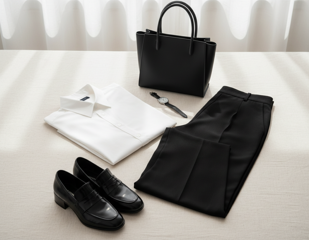
Workwear
Keep prints muted and contrast controlled. Structured layers—blazers or tailored trousers—signal professionalism. A subtle-print blouse worn under a solid suit reads intentional rather than casual.
- Work formula: printed blouse + solid suit + neutral shoe; or subtle-print dress + blazer + structured bag.
Evening
Shift toward deeper colours, richer fabrics, and one refined shine. Silk-like finishes, satin touches, or a single metallic accessory elevate a look without adding clutter.
“One statement at a time keeps visual balance and prevents overwhelm.”
Practical notes: account for office A/C, commuting, and seasonal layers. Use solid layers only—avoid adding another print. Across occasions, maintain a single statement piece for lasting balance.
Common Mistakes That Make Mixed Prints Look Busy
Most chaotic mixes reveal themselves as a handful of competing focal points rather than a single readable idea.
Too many motifs without a shared color story
Description: several unrelated patterns in clashing hues make the brain fail to group the look.
Fix: repeat one or two colors across pieces. That single tie creates instant balance.
Over-accessorizing and competing focal points
Description: big earrings, a loud bag, and bold shoes create four competing headlines.
Fix: choose one hero accessory and keep the rest minimal. Less is decisive here.
Ignoring fabric weight and texture for the time of day
Description: shiny or heavy textiles can read overdressed during daylight hours.
Fix: match fabric weight to occasion and climate; pick lighter textures for daytime.
Off proportions: oversized layers on maxis and bulky pairings
Description: a roomy jacket over a voluminous dress often erases shape and adds bulk.
Fix: swap in a cropped, structured layer or keep one piece streamlined.
“Reset method: remove accessories first, then outer layer, then swap one print; check in a mirror or photograph from a distance.”
- Use the reset method stepwise until visual balance returns.
- Photograph the full outfit; distance reveals busy composition faster than a close mirror.
How to Shop Patterned Items So They Don’t Sit in the Closet
Treat each patterned purchase like an investment: know where it will live in your wardrobe before the price tag is final.
Assess wearability and cost-per-wear
Do an occasion mapping list: work, weekend, formal events, travel. Mark which patterns will get repeat use.
Cost-per-wear is simple: a pricier print is worth it if it fits several entries on that list across seasons.
Pick the right garment type
A printed dress is one-and-done and fast for mornings. Separates buy flexibility; a printed top can be mixed with many bottoms.
Timeless versus trend
Choose classics—stripes, small geometrics, polka dots—for core items. Reserve trend prints for scarves, bags, or low-cost tops that rotate out later.
Fitting-room checklist and one-outfit rule
- Check scale near the face, daylight opacity, and contrast.
- Make sure the piece works with at least one owned shoe, layer, and bag before checkout.
“The best patterned items are the ones worn often, not the ones that look like costumes.”
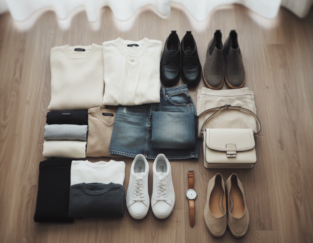
Building a Print-Friendly Wardrobe: A Simple Mix-and-Match System
A simple framework helps readers build a closet where prints get worn, not stored. The system uses three repeatable parts: a personal palette, neutral anchors, and a one-statement rule that keeps visual interest controlled.
Create a personal color palette
Choose 3 neutrals and 2 accents. Neutrals—navy, camel, black—form the base, while two accent hues guide print selection and make shopping faster.
When shopping, pick pieces that show at least one palette hue. This reduces mismatches and speeds outfit assembly.
Keep a neutral anchor set
Core items make prints wearable immediately: a solid blazer, dark denim, trench, fine knit, neutral shoes, and a structured bag.
These pieces act as fail-safes. If a new printed item pairs with three anchors, it earns a place in the wardrobe.
Use one statement piece per look
Limit visual headlines by letting a single item lead. Let accessories whisper—small jewelry, a compact bag, or simple shoes finish the look.
Capsule approach: invest in one or two signature prints that match lifestyle, then add small accents over time. Track gaps: if a new skirt needs new shoes and a top, it is likely not anchor-friendly.
“Intentional repetition turns bold pieces into reliable wardrobe players.”
Conclusion
, Summary: this article distills a reliable method: inspect pattern anatomy (scale, density, contrast, order, coloring, placement, style association), then use color harmony and a leader/supporter hierarchy for clear results in everyday styling.
Start simple: pick one hero print and give it solid breathing room. Add a second print only if it shares a color and differs in scale. For a printed dress, that rule makes morning decisions fast and repeatable.
Keep accessories quiet and layers purposeful. Denim, a tailored blazer, trench, or leather piece adds shape and calms busy prints. Use the formulas for daytime ease, restrained work looks, and evening polish with one subtle shine.
Next step: choose one patterned item already owned, assemble a full look, and photograph it. Use the checklist again whenever shopping or styling feels uncertain—prints work best when treated as clear design tools rather than rules to fear.